The influx of portable devices in recent years has undoubtedly changed our lives. With foldable smartphones, wearables, tablets, and hybrid devices that blur the line between laptops and tablets, the range of gadgets we use daily has expanded significantly. It’s a lot to take in.
You may feel overwhelmed by what these devices do and how they affect the web. You may also be confused by the terminology: “responsive,” “click vs. touch,” “screen size,” and more. But here’s the thing: the website you’ve relied on for your business over the last 5-10 years, or even longer, likely won’t cut it anymore in 2025 and beyond. The expectations of your customers and the demands of modern technology have evolved.
Beyond understanding the new devices, a whole new world of website design and development has emerged to meet the demands of today’s hyper-connected users. The adoption rate of smartphones, tablets, and even smart TVs has skyrocketed. With this, mobile-friendly websites have become paramount. This is where “Responsive Web Design” comes in. But what exactly does that mean in 2025?
The Evolution of Responsive Web Design
Before the proliferation of mobile devices, web designers had one main goal: ensuring that websites looked consistent across all major desktop browsers. Fast forward to today, and the landscape has shifted entirely. Designers and developers now face the challenge of creating websites that deliver an optimal user experience across various devices and screen sizes, from large desktop monitors to pocket-sized smartphones and even smartwatches.
Optimal viewing experience means:
- Ease of reading
- Intuitive navigation
- A consistent look and feel
- Quick access to business information
- Minimal resizing, panning, or scrolling
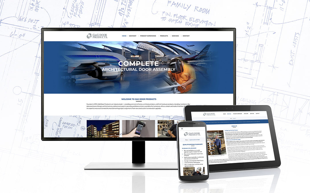
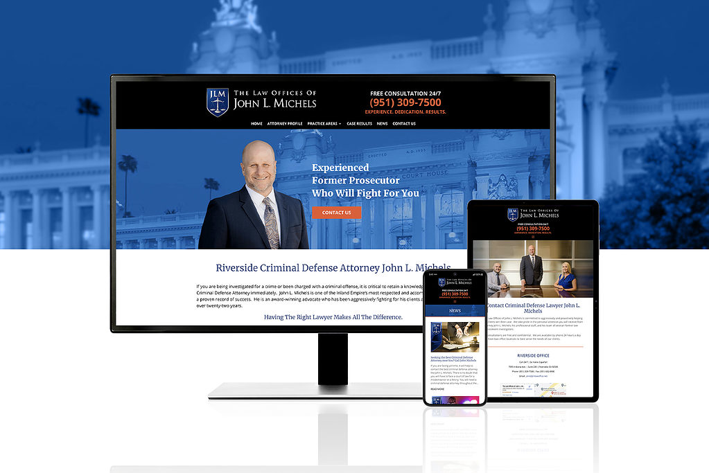
Modern responsive design includes touch interfaces, variable internet speeds, and dark mode preferences. A truly responsive website adapts dynamically to the user’s device, ensuring a seamless experience no matter where or how it’s accessed. This eliminates the outdated need for separate desktop and mobile websites. Your “Responsive Website” can do it all — and do it well.
Advantages of Responsive Web Design in 2025
- Responsive Sites Are Fluid and Adaptable
Modern responsive websites use advanced techniques to create layouts that flow effortlessly across devices. Content adapts dynamically to the screen, ensuring readability and usability whether on a 6-inch smartphone, a 12-inch tablet, or a 55-inch smart TV. With foldable phones and other emerging technologies, responsive designs are even beginning to account for screens that can physically change size. - Cost-Effective and Efficient
A responsive website means you only need one website to serve all devices. No more juggling separate “desktop” and “mobile” versions. This consolidation reduces development and maintenance costs, freeing resources to focus on other aspects of your online presence, like SEO and content marketing. - Improved SEO Performance
Google emphasizes the importance of mobile-first indexing, meaning your site’s mobile version is often considered the primary version for ranking purposes. Responsive web design ensures that your site meets Google’s criteria for a mobile-friendly experience, giving you a natural SEO boost. Plus, with responsive design, you eliminate duplicate content issues from maintaining separate desktop and mobile sites. - Enhanced User Experience
In today’s fast-paced world, users demand quick, intuitive, and aesthetically pleasing web experiences. Happy users are likelier to engage with your content, share it with others, and ultimately become loyal customers. Responsive websites deliver this by providing:- Fast loading times (thanks to optimized code and images).
- Intuitive navigation (designed with both touch and click in mind).
- Seamless integration of features like voice search, location services, and accessibility tools.
- Future-Proof Design
The tech landscape is ever-changing. By adopting responsive web design, you’re preparing your website for the future. Whether it’s foldable screens, augmented reality (AR) interfaces, or new device categories we haven’t even imagined, a responsive foundation ensures your site can evolve with the times.
Key Trends in Responsive Design for 2025
- Variable Fonts: These enable typography to scale and adapt fluidly to different screen sizes, ensuring readability while maintaining design integrity.
- Designing for Accessibility: Websites that prioritize accessibility for users with disabilities are more inclusive and favored by search engines and customers alike. We recommend AccessiBe for website ADA compliance.
- AI-Driven Personalization: Responsive designs can incorporate AI to deliver personalized content and experiences based on user behavior, preferences, and location.
Why You Need Responsive Design Now
Your website often gives potential customers the first impression of your business. In 2025, a non-responsive website sends a message that your business is outdated and out of touch with modern consumer expectations. On the other hand, a well-designed responsive site can:
- Instantly build trust and credibility.
- Encourage users to spend more time on your site.
- Drive higher conversion rates.
Responsive web design is no longer optional; it’s a necessity. As devices and user behaviors evolve, having a responsive site ensures you stay ahead of the curve.
Let’s Make Your Website Responsive
At G3 Creative, we specialize in creating responsive websites that are not only visually stunning but also optimized for performance, usability, and search engines. Whether you need a complete redesign or an upgrade to your site, we’re here to help.
Contact us today to discuss your website needs and how we can help you stay ahead in the digital age. Let’s create a responsive web presence that works for you in 2025 and beyond!